It Usually Starts Simple
Your brand just expanded to the Middle East. The logo looks great. The packaging looks… off. The Arabic text feels heavier, cramped, like it’s fighting the layout.
Someone asks, “Can we support Arabic?”
The solution seems easy. Add an Arabic font that “matches.” Same weight, similar mood, close enough.
On paper, the problem is solved. In reality, the brand suddenly feels inconsistent. The typography looks like it’s switching personalities depending on the language.
Why This Becomes a Problem
Arabic and Latin don’t behave the same way.
Arabic letters connect. Latin letters don’t. That one difference breaks spacing, rhythm, and how text sits on a page.
When Arabic is forced into a system designed only for Latin, issues start to appear.
What Clients Usually Notice
Clients don’t complain about script theory. They notice symptoms:
- Arabic looks heavier
- Lines feel cramped
- Headings don’t align
- The brand feels inconsistent
These are not technical issues in their eyes. They’re brand problems.
And brand problems mean: slower approvals, more revisions, regional teams constantly asking for layout fixes.
When the Pain Becomes Obvious
This usually happens when:
- Arabic and Latin appear side by side
- Products scale across regions
- Teams keep fixing typography manually
Typography stops being invisible and starts slowing things down.
A More Sustainable Way Forward
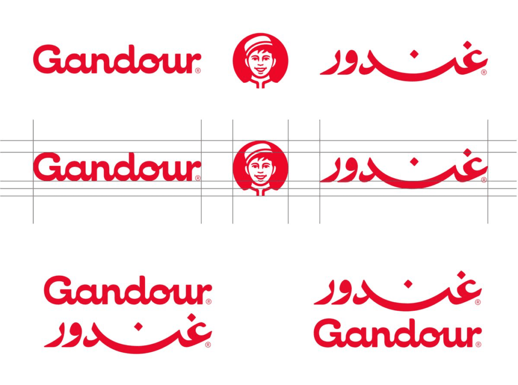
Arabic–Latin multiscript typography treats both scripts as part of one system from the start.
It doesn’t mean they look identical. It means they are designed to work together.t
In Short
Arabic–Latin multiscript typography isn’t about complexity. It’s about removing friction before it becomes expensive—before your next campaign, before your next market, before your next revision cycle.